Pie Menus: A 30 Year Retrospective
By Don Hopkins, Ground Up Software, May 15, 2018.
Take a Look and Feel Free!

Today (May 15, 2018) is the 30 year anniversary of CHI’88 (May 15–19, 1988), where Jack Callahan, Ben Shneiderman, Mark Weiser and I (Don Hopkins) presented our paper “An Empirical Comparison of Pie vs. Linear Menus”. We found pie menus to be about 15% faster and with a significantly lower error rate than linear menus!
This article will discuss the history of what’s happened with pie menus over the last 30 years (and more), present both good and bad examples, including ideas half baked, experiments performed, problems discovered, solutions attempted, alternatives explored, progress made, software freed, products shipped, as well as setbacks and impediments to their widespread adoption.

“The most profound technologies are those that disappear. They weave themselves into the fabric of everyday life until they are indistinguishable from it.”
Apple’s recent product launch on 12 September has cast into the mainstream technologies that were first envisioned by Mark Weiser in the 1990s, when he was Chief Technologist at Xerox’s Palo Alto Research Center (PARC). Though Weiser died in 1999, at the age of 46, his ideas continue to inspire cutting-edge smartphone innovations. The release of Apple’s new iPhones and operating system this Fall signals a new stage in the tech industry’s commitment to making Weiser’s vision a mass market reality. Now is a good time to revisit Weiser’s ideas; his work foreshadows how our smartphones and the ways we use them may soon change.
My Goals for Pie Menus

My goals are to enable developers, designers, and users to easily create and edit their own pie menus, and provide free software, tested designs, smart editors, automatic layout, support and guidance to help people come up with fun, easily used, memorable, Fitts-friendly designs. And also to dispel some of the myths, prejudices, and FUD that some people have spread by exploiting their well funded high profile corporate platforms and teams of patent lawyers and marketing representatives, to tangibly stifle progress and hold back the widespread adoption of pie menus.

“Leonardo Da Vinci combined art and science and aesthetics and engineering, that kind of unity is needed once again.”
-Ben Shneiderman
Pie Menus on Wikipedia
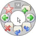
In computer interface design, a pie menu (also known as a radial menu) is a circular context menu where selection depends on direction. It is a graphical control element. A pie menu is made of several “pie slices” around an inactive center and works best with stylus input, and well with a mouse. Pie slices are drawn with a hole in the middle for an easy way to exit the menu.
Fitts’s Law
Fitts’s Law has deeply inspired my work with pie menus and gestural direct manipulation user interfaces over the years. In a nutshell: the bigger and nearer by the target, the faster and more accurately you can hit it. Pie menus maximize the target size, and minimize the target distance!

Fitts’s law (often cited as Fitts’ law) is a predictive model of human movement primarily used in human–computer interaction and ergonomics. This scientific law predicts that the time required to rapidly move to a target area is a function of the ratio between the distance to the target and the width of the target. Fitts’s law is used to model the act of pointing, either by physically touching an object with a hand or finger, or virtually, by pointing to an object on a computer monitor using a pointing device.
History of Pie Menus
The classic 1969 “PIXIE” paper by Neil Wiseman, Lemke, and Hiles had the first mention of circular menus, which was referenced in Newman and Sproull’s 1979 seminal book “Principles of Interactive Computer Graphics”. The “lightbuttons” were apparently target area based (selected “by pointing at one of them”), unlike pie menus which are based purely on the direction of the gesture, resulting in a large wedge shaped target area extending to the screen edge, not just the small rectangular area of the “lightbutton” label:
PIXIE: A New Approach to Graphical Man-Machine Communication
Wiseman, N.E., Lemke, H.U. & Hiles, J.O. (1969) PIXIE: A New Approach to Graphical Man-Machine Communication, Proceedings of 1969 CAD Conference Southampton, IEEE Conference Publication 51, 463–471.
Contents of Page 466–467

The control lightbuttons which are used frequently within a mode to carry out a sequence of operations. These buttons are displayed around the tracking cross and move about with it so that the user’s hand is always close to these buttons when he needs them. To avoid clustering a large number of control buttons around the tracking cross, it is arranged that only buttons for those actions which are legal at any given time are displayed and also that the user may select different sets of legal buttons by pointing at one of them (which acts as a sort of rotating switch for the rest).
Wiseman’s Notes on Radial Menus in PIXIE
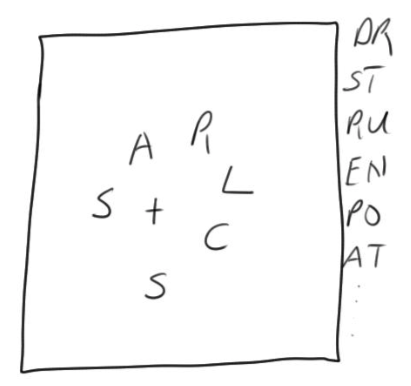
Control lightbuttons:
These vary according to the command mode currently selected. In drawing mode they are:
S: Start to draw under horizontal-vertical constraints from the + position
L: Start to draw rubber band line at current + position
F: Finish drawing at the current + position
W, X, Y…: Select a symbol from the catalogue of defined symbols and attach to the drawing at the current + Position
Principles of Interactive Computer Graphics
William M. Newman, Robert F. Sproull. McGraw-Hill, 1979.
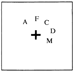
An interesting idea, proposed by Wiseman [520], is the use of a moveable menu displayed close to the cursor (Figure 12–35). The user can make selections from such a menu with the minimum of hand movement. Moveable menus should be displayed only when the user needs to make a menu selection; otherwise they tend to obliterate important parts of the displayed image.
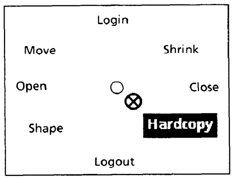
How to Choose with Pie Menus
Selecting commands from menus is an easy, straightforward way to operate a computer. You can use a pointing device called a “mouse” to indicate the selection you desire, from a list of choices show on the screen. Pie menus (Figure 1) differ from traditional “linear” menus (Figure 2) in the way that their choices are laid out, and the shape of their selection target areas on the screen.
An Empirical Comparison of Pie vs. Linear Menus
Jack Callahan, Don Hopkins, Mark Weiser, Ben Shneiderman. Computer Science Department University of Maryland College Park. ACM CHI ’88 Conference.
Menus are largely formatted in a linear fashion listing items from the top to bottom of the screen or window. Pull down menus are a common example of this format. Bitmapped computer displays, however, allow greater freedom in the placement, font, and general presentation of menus. A pie menu is a format where the items are placed along the circumference of a circle at equal radial distances from the center. Pie menus gain over traditional linear menus by reducing target seek time, lowering error rates by fixing the distance factor and increasing the target size in Fitts’s Law, minimizing the drift distance after target selection, and are, in general, subjectively equivalent to the linear style.
CHI’88 Trip Report
by Jakob Nielsen on June 1, 1988
Some new stuff was presented such as the pie menus studied by Callahan, Hopkins, Weiser, and Shneiderman from the University of Maryland. When used as pop-up menus, pies have the advantage that any menu item can be selected by equally small movements of the mouse and the study did indeed show that users performed about 15% faster using a pie menu than using a linear menu. Pie menus also have some potential disadvantages, especially when used with many menu items or in cases that call for hierarchical pop-ups.
Steve Jobs Thought Pie Menus Sucked
“That sucks! That sucks! Wow, that’s neat! That sucks!”
On October 25, 1988, I gave Steve Jobs a demo of pie menus, NeWS, UniPress Emacs and HyperTIES at the Educom conference in Washington DC. His reaction was to jump up and down, point at the screen, and yell “That sucks! That sucks! Wow, that’s neat! That sucks!”
I tried explaining how we’d performed an experiment proving pie menus were faster than linear menus, but he insisted the liner menus in NeXT Step were the best possible menus ever.
But who was I to rain on his parade, two weeks after the first release of NeXT Step 0.8? (Up to that time, it was the most hyped piece of vaporware ever, and doubters were wearing t-shirts saying “NeVR Step”!) Even after he went back to Apple, Steve Jobs never took a bite of Apple Pie Menus, the forbidden fruit. There’s no accounting for taste!
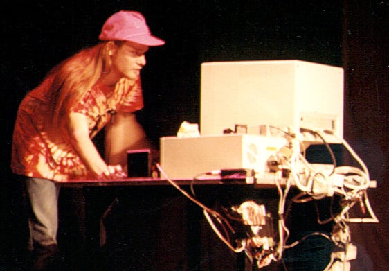
Good Example: HCIL Demo — HyperTIES Authoring with UniPress Emacs on NeWS
Demo of UniPress Emacs based HyperTIES authoring tool, by Don Hopkins, at the University of Maryland Human Computer Interaction Lab. Shows tabbed windows in Gosling’s UniPress Emacs with pie menus for editing HyperTIES hypermedia databases.
Good Examples: Just the Pie Menus from All the Widgets
Pie menu demo excerpts from “All The Widgets” CHI’90 Special Issue #57 ACM SIGGRAPH Video Review. Tape produced by and narrated by Brad Meyers. Research performed under the direction of Mark Weiser and Ben Shneiderman. Pie menus developed and demonstrated by Don Hopkins.
Good Example: PSIBER Space Deck Demo
The PSIBER Space Deck is an interactive visual user interface to a graphical programming environment, the NeWS window system. It lets you display, manipulate, and navigate the data structures, programs, and processes living in the virtual memory space of NeWS. It is useful as a debugging tool, and as a hands on way to learn about programming in PostScript and NeWS.
Empowered Pie Menu Performance at CHI’90, and Other Weird Stuff
A live performance of pie menus, the PSIBER Space Deck and the Pseudo Scientific Visualizer at the CHI’90 Empowered show. And other weird stuff inspired by Craig Hubley’s sound advice and vision that it’s possible to empower every user to play around and be an artist with their computer.
“By pushing the pie-menu interface to the limit you get a *gesture interface* that ties the tools so tightly and personally to their user that they effectively become one cooperative entity.”
Good Example: Pie Menus and Tab Windows for NeWS
Demo of the Pie Menu Tab Window Manager for The NeWS Toolkit 2.0. Developed and demonstrated by Don Hopkins. Shows mouse-ahead display pre-emption.
The Design and Implementation of Pie Menus
Don Hopkins. Dr. Dobb’s Journal, Dec 1991.
This article describes an alternative user-interface technique I call “pie” menus, which is two-dimensional, circular, and in many ways easier to use and faster than conventional linear menus. Pie menus also work well with alternative pointing devices such as those found in stylus or pen-based systems. I developed pie menus at the University of Maryland in 1986 and have been studying and improving them over the last five years.
BAYCHI October Meeting Report: Natural Selection: The Evolution of Pie Menus, October 13, 1998

Pie menus appealed to Hopkins because they conform to the rule that the user’s attention should not be squandered. […] Hopkins uses pie menus because they take advantage of Fitts’ Law, which relates fast selection speed and low error rate to the pie menus’ large target size and small distance between selections.
Useful Technique: Mouse Ahead Display Preemption
The first step in learning a pie menu, using it in “novice” mode, is rehearsal for using it in “expert” mode. So if you remember that you want to move the mouse down, you can press and move the mouse, then you wait, and it pops up only after you stop moving.
Pie menus should support an important technique called “Mouse Ahead Display Preemption”. Pie menus either lead, follow, or get out of the way. When you don’t know them, they lead you. When you are familiar with them, they follow. And when you’re really familiar with them, they get out of the way, you don’t see them. Unless you stop. And in which case, it then pops up the whole tree.
Fun Example: X11 SimCity Demo
Demo of Pie Menus in SimCity for X11. Ported to Unix and demonstrated by Don Hopkins. Shows mouse ahead display suppression, and pie menus saving the day by preventing a train from crashing into a fountain just in the nick of time at 3:30.

The first step in learning a pie menu is remembering the direction, pressing, moving, waiting to see the feedback, recognizing that you’re right. then releasing.
But experts will then get enough confidence to just press, move and release, like that, and it pops up the next one.
And you can cascade these: press, press and press, oh let’s wait to see that we’re sure, ok good, now release. Or press, press and press, and I’ll be there at that time, whatever it is.
Obviously what’s important for feedback when you’re using mouse-ahead is that the application will show you in real-time what the effects of the menu are, so that it’s not necessary to see the menu.
Difficult Problem: Designing, Creating and Editing Pie Menus
When editing a scrolling list or tree of items, it’s difficult to visualize the directions, which change when you add or remove items. As the antithesis of direct manipulation, it takes far too much pointing and clicking to indirectly edit a pie menu via a scrolling list or tree control.
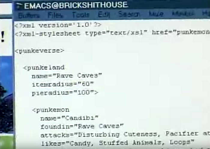
Entering an indented outline into a text editor is an easy way to quickly define and edit a tree of pie menus and submenus, but it doesn’t give you a good way to edit properties of each item. Of course describing menus in XML is great if you’re a web server, but not fun for human beings.
I tried to combine these different techniques of editing pie menus in a tabbed dialog, with a scrolling list and controls for editing items, a tree of nested items and a graphical preview, a text editor for entering nested items as an outline, loading and saving XML.
But the result was a horribly unwieldy Frankinterface’s Monster, difficult for a professional UI designer to use, and impossible for end users to use.
Terrible Example: ActiveX Pie Menus
This demo of an old OLE/ActiveX implementation of pie menus in Internet Explorer shows the weakness and complexity of the traditional desktop GUI MFC based approach to creating and editing pie menus with typical property sheets, scrolling lists and tree editors. It also has a weird way of paging between large numbers of items in pages of eight or fewer items each, which I was never very happy with. And programming complex user interfaces with XML/C++/ActiveX/OLE/MFC/Win32 is hell on earth.
Microsoft has developed OLE (aka ActiveX) to solve the problem of creating dynamically loaded plug-in user interface components. It allows components written in any language to be loaded dynamically at run time and integrated with any other language, and it allows programmers as well as more casual interface designers to plug components together and configure them with property sheets.

I implemented an ActiveX pie menu control, so that pie menus can be used on web pages and in other Windows applications. The source code as well as the binary is freely available. Now it is quite easy for other people to integrate ActiveX pie menus into their own applications and configure them to their liking.
I’ve used ActiveX pie menus as a vehicle to experiment with all kinds of different layout and interaction styles. They’ve got lots of property sheets to set all the various modes and attributes, and you can type in a nested submenu tree as an indented text outline.


I implemented graphical menu items, but I still want them to be animated. A while ago I started adding the ability to read and write nested pie menu specifications as xml.
I wanted to add all kinds of other features, but there needed to be an easy concise way to read, write and configure them all. I finally realized that I had hit a brick wall with ActiveX, in the face of all the complexity and things I wanted to be able to do with pie menus, compared to what could be done on a web page with dynamic html.


Better Example: Dynamic HTML JavaScript Pie Menus with ActiveX HTML Behaviors

I want each menu item to be any dynamic html object, like a movie, or a java applet, or an ActiveX control. And I want the graphics and interactive feedback to exploit the full capabilities of dynamic html, like making the point size of the label grow continuously larger as you move the cursor into the slice. That way you can integrate JavaScript, HTML, CSS, XML, XSTL and many other technologies to make pie menus!
It was impossible to play keep-up with the capabilities of a web browser by adding feature after feature to my little ActiveX control, so what I really needed was for pie menus to be specified in XML or JSON, and implemented inside the web browser using dynamic HTML on the web page itself, instead of using a shrink wrapped plug-in control that opens and draws its own windows, but can’t interact with the rest of the web page.
So I’ve shelved the ActiveX pie menu, and decided to rewrite pie menus in JavaScript and dynamic HTML. I’ve done that a few times, and it works very well, and keeps getting better each time as the platform evolves! The first was for Internet Explorer ActiveX HTML Behaviors, then for a gesture tracking library called hammer.js, and also for jQuery. I hope to inspire others to develop more and better implementations of pie menus on other user interface frameworks!)
Scientific American Article: Taking Computers to Task: 7/97
“It’s time to get angry about the quality of user interfaces,” exclaims Ben Shneiderman, head of the Human-Computer Interaction Laboratory at the University of Maryland.
“The public doesn’t understand what they could have had by now,” agrees Bruce Tognazzini, a designer who helped to develop the original Macintosh interface.
They and others argue that applying human-factors research to existing software technology could make workplace computer systems dramatically more productive, easier to use and cheaper to support.
Four Innovations That (Might) Improve Work: #2: Pie Menus:
These arrange command options as sectors in a circle instead of segments on a bar. “They are 30 percent faster and have half the error rates of menu bars,” Shneiderman says.
“We remember angles much better than distances,” explains Ted Selker of the IBM Almaden Research Center in San Jose, Calif. “So pie menus allow you to make choices much more rapidly, relying on muscle memory.”
These arrange command options as sectors in a circle instead of segments on a bar. “They are 30 percent faster and have half the error rates of menu bars,” Shneiderman says.
Useful Technique: Interactive Tracking Callbacks for Immediate Feedback and In-World Previewing
Pie menus should provide a complete set of callback events during tracking, so applications can provide real-time dynamic feedback, both providing feedback and help text within the pie menu itself (like a font size or color menu showing a live sample in the middle of the menu), or temporarily previewing the effect of the menu selection within the application or world.
Ideally, you see exactly the results you’ll get as you’re moving around the menu, and when you click to select, the world will just stay the same since it’s already previewing: what you see is what you get!
You can also provide all kinds of cool spinning, zooming and flying animations as feedback, but try to keep it practical, to focus and inform instead of dazzle and distract. One thing that’s helpful is to smoothly animate the selected item growing and moving towards the cursor (because that’s where your eyes are usually looking), while shrinking and pulling the other items back in, and popping up some text to describe the selected menu item in more detail.
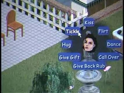
The Sims pie menus show the currently selected Sim’s head in the menu center, looking straight at you if nothing’s selected, and turning to look at the selected item, like the Brady Bunch intro. That helps you identify which character the menu will affect, and focus on which item is selected.
When I implemented this effect, I actually wanted to make the Sim’s heads nod or shake according to how much they wanted to perform the selected item (so she’d look delighted about “Tickle”, or shy about “Kiss”). But that would have been a burden to produce and program for every menu item, and we had to stop thinking of cool stuff to do and just ship the damned game.
Good Example: Unity3D Pie Menus
This Unity3D implementation of pie menus has support for creating and configuring pie menus from within the Unity editor, both through traditional editor control panels, and direct manipulation of 3D objects. And it has a complete set of callback events that can provide all kinds of interesting feedback within Unity, like mapping your face from webcam video onto a 3D head in the middle of the menu that looks around at the selected slice!
Good Idea: Pies Contain Slices. Slices Contain Items.
Earlier implementations of pie menus used the Pie/Item model, in which the pie menu contains one or more items, which are positioned around the menu center in an evenly spaced circle. There was is no way to specify an empty slice, and no way to put more than one item in a slice. And the directions of most of the items would change every time you added or removed an item, so it was very hard to control or visualize which direction each item ended up.
The Pie/Slice/Item model enables designers to first specify the number of slices a menu contains (which has a major effect on usability, with 4 and 8 being ideal numbers of slices), and then independently populate each slice with zero or more items.
So the directions of the slices remain stable during construction and editing, because you can start by creating an 8 slice menu, and then incrementally drop any number of items into it each slice, or none at all.
This stability makes it much easier to provide good defaults (like four and eight slice menus), and for users to easily create and edit their own menus with drag-and-drop direct manipulation interfaces.
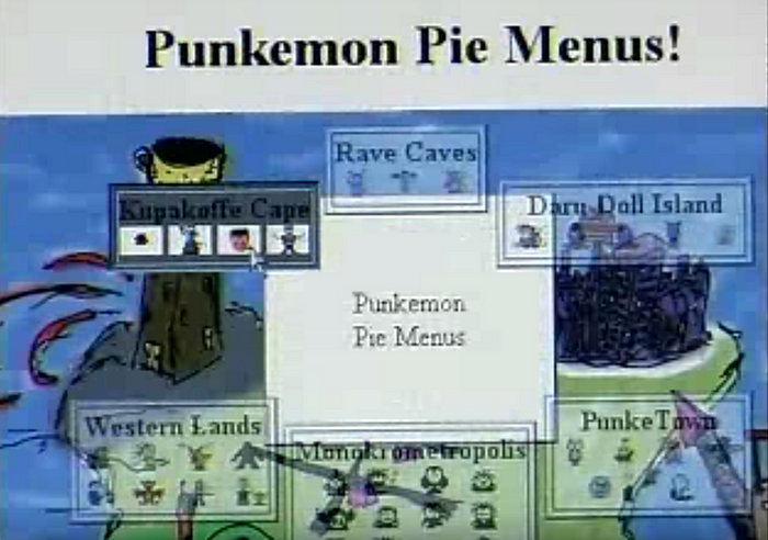
Great Example: jQuery Pie Menus
These jQuery pie menus use the Pie/Slice/Item model, with a more evolved, web friendly design, but I haven’t made an editor for them yet. Here’s the documentation and free open source code.
jQuery Pie Menus Documentation
One change is that I’m de-emphasizing the idea of “menus”, and just calling them “pies”, because I believe that framing pies as menus has too much historical baggage, does not emphasize their gestural, direct manipulative qualities, and precludes thinking of them more like a directed graph or geographical map, instead of a hierarchical tree.
jQuery Pie Menus Source Code
Pie menus for jQuery, by Don Hopkins.
Hard Problem: Designing Memorable Pie Menus
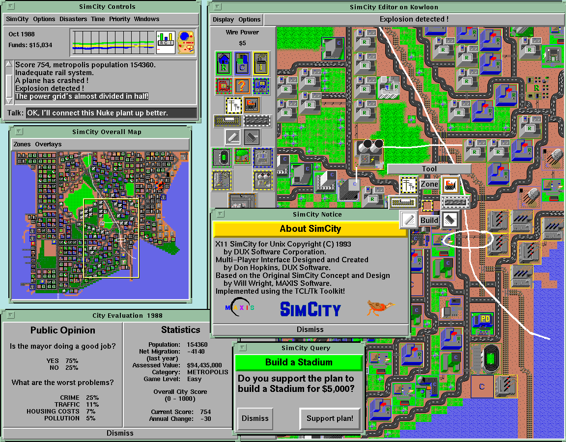
SimCity has a tool pallet of various building and editing tools, which are related to each other in various ways, and have different costs, functions and properties. I tried to arrange them into a set of submenus that made those relationships and differences more obvious and easier to learn. I also arranged the static tool palette on the screen to reflect the layout of the pie menus and submenus, to serve as a kind of map to the pie menus (which foreshadowed the spatial map design I explored with Method of Loci, described in another article).
Good Example: SimCity Pie Menus and Tool Palette
This is the multi player version of SimCity running on a Sun workstation on TCL/Tk/X11, showing the tool palette on the left side of the map, and the “Tool” pie menu popped up over the map:


The top level “Tools” menu includes: magic marker and eraser (for drawing on the map), roads and rails, power lines and a bulldozer, and submenus for common zones and bigger buildings. The zone submenu includes residential, commercial and industrial zones, police and fire stations, and a query tool. The building submenu includes a stadium, park and seaport, coal and nuclear power plants, and an airport.
As you can see, the layout and design of the Tool Palette reflects the layout and design of the menus, so they reinforce each other.

The size of each icon reflects the cost of the tool. The borders of the icons are color coded to reflect the cursor you see on the map that shows where the tool will affect.
That was useful for multi player mode, so you could see which tools the other players had selected, as the tool palette served as a legend for the cursors on the screen.
The tool palette looks kind of like a totem pole, which is vertically asymmetrical, differentiating different kinds of tools and making them look unique, and horizontally symmetrical, reflecting pairs of similar tools and making it look aesthetically pleasing and more memorable than a regular grid.
If all the tools were the same sized squares arranged in a regular grid, it would be much harder to differentiate them and quickly select the one you want. Instead, they’re arranged more like a bouquet of unique flowers that each have their own special features that make them easily recognizable and memorable, while telling you something about themselves.
Designing user interfaces this way is a artistic balancing act, highly dependent on the set of commands, and requiring a lot of iteration, testing and measurement, as well as willingness to explore and experiment with many different alternatives.
It is not easy, and there is never a best solution, or even always a good one. It’s not something you can expect end-users to be able to easily do with their own custom built menus. But it’s worth the effort to try, and I think it’s also worth the effort to train designers and even users to promote a literacy in Fitts’ Law and interface design.
Deep Example: The Sims Pie Menus
This is a video and illustrated transcript of a demonstration of the pie menus, architectural editing tools, and Edith visual programming tools that Don Hopkins developed for The Sims with Will Wright at Maxis and Electronic Arts.
Challenging Problem: Enabling and Educating Users to Design Great Personal Interfaces For Themselves
I think an important goal is to not only give users the tools to create their own pie menus, but design tools that support and motivate user to intuitively understand Fitts’s law, and how to design good pie menus for themselves.
In tools like Alias or games like World of Warcraft, each artist or user has a very particular set of commands they want to use at any particular time (because characters play different roles and have different abilities, spells and items, which changes over time and with different activities), so it’s desirable to support user-defined interfaces constructed by dragging and dropping command icons around to create your own custom toolbars and pie menus.
Crazy Example: PieCraft
One idea I’ve had is to develop a game called “PieCraft”, that has user-editable pie menus that are first-order in-game player craftable artifacts.
World of Warcraft and its rich ecosystem of user interface extensions supports a wide range of player customizable user interfaces, because there are so many different commands, spells, buffs, weapons, armor, etc, and each role of each character of each player requires a totally different set of them in different situations.
The more casual MMPORG “Glitch” had bags that users could arrange in hierarchies and put their items inside, which were surfaced on the user interface as buttons they could press and objects they could drag in and out of the world and other bags. How well you arrange your items in WoW and Glitch had a significant effect on gameplay.
PieCraft could take this further, to train players in user interface design literacy (much like “Code Hero” aims to train players in computer programming).
You could find empty or pre-populated pie menus in the world, pick them up and make them your own, and edit them by moving items around, putting them inside of other menus, and modifying them as you leveled up and earned more powerful menu editing skills and resources.
The capacity and layout and allowed contents of some menus could be restricted, to constrain the ways you used them, forcing you to figure out which were your most important items, and giving them front row seats so they were easiest to select.
To put further pressure on players to design efficient menus, your menus could be vulnerable to attack from warriors or theft from pickpockets while they were popped up, and only be able to take a limited amount of damage (depending on if they were crafted from wood or diamond).
When hit hard enough, items could break loose and fall on the ground, or a whole slice or menu could break open like a piñata and spill all its items into the world. Then you (and your enemies) would have to scramble to pick up all the pieces!
The sense of urgency and vulnerability while the menu was popped up would compel you to “mouse ahead” to get through the menus quickly, and arrange your most important items so you could find and select them as quickly as possible.
It would reward you for successfully “mousing ahead” swiftly during combat, by avoiding damage from attack and loss from thieves, and awarding power-up points and experience.
Awesome Example: Monster Hunter: World — Radial Menu Guide
Monster Hunter: World is a wonderful example of a game that enables and motivates players to create their own pie menus, that shows how important customizable user defined pie menus are in games and tools.
Want access to all your items, ammo and gestures at your fingertips? Here’s a quick guide on the Radial Menu.
With a multitude of items available, it can be challenging to find the exact one you need in the heat of the battle. Thankfully, we’ve got you covered.
Here’s a guide on radial menus, and how to use them:
The radial menu allows you to use items at a flick of the right stick.
There are four menus offering access to eight items each, and you can fully customize them, all to your heart’s content.
Radial menus are not just limited to item use, however.
You can use them to craft items, shoot SOS flares, and even use communication features such as stickers and gestures.
Excellent Example: An Empirical Evaluation of Some Articulatory and Cognitive Aspects of Marking Menus
Gordon P. Kurtenbach, Abigail J. Sellen, and William A. S. Buxton. Computer Systems Research Institute, University of Toronto. Human Computer Interaction 8(1), p. 1–23.
This otherwise excellent paper, published in 1993, makes the mistake that pie menus don’t support what I call “mouse ahead display suppression”, which enables users to select from menus without popping them up on the screen. Both pie menus and marking menus ease the transition from novice to expert user.
Marking menus are also unique in that they ease the transition from novice to expert user. Novices can “pop-up” a menu and make a selection, whereas experts can simply make the corresponding mark without waiting for the menu to appear.
English Translation: Physical and Mental Effects of Pie Menu Design
I’ll try to explain some of the practical results of the paper “An Empirical Evaluation of Some Articulatory and Cognitive Aspects of Marking Menus” in everyday language you don’t need a PhD in TLAs to understand, and I’ll summarize some useful design techniques and rules of thumb that may or may not be obvious at first glance, but have been discovered and proven by experimentation and measurement.
Even if you have incredible dexterity, photographic memory and lots of free time, you have better things to spend it on than menus.
With 2 or 4 slices, Fitts’s Law has an overwhelming effect, because each slice’s target area is enormous (1/2 or 1/4 of the entire screen area), and adjacent to the cursor which starts in the center of the menu. (Maximizing the area, minimizing the distance).
The physical (articulatory) effects of Fitts’s Law diminish as you add more slices (the target area decreases, but the distance remains a small fixed constant), but there are other important mental (cognitive) effects that come into play: the mental effort of remember the directions, and the mental framework you use to think, learn and recall.
There are many conflicting trade-offs and opportunities: How can you design pie menus that are easy to physically use and mentally remember? How many slices are there, and what are their relationships and structures? Are you ordering food from restaurant menu, managing windows, picking tools, issuing commands, hunting monsters, or wandering around a Memory Palace? What kind of mental framework can you use to organize the slices around?
Tip: Even Symmetrical Common Patterns Are Good
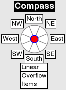
With 7 slices, there is no common English word or concept for all but one of the directions. But with 8 slices, you benefit from the compass framework, opposite pairs, orthogonal axis, vertical, horizontal or diagonal patterns to use as a framework for arranging the slices. And with 12 slices, you benefit from the clock dial framework, as well as pairs, orthogonal and diagonal patterns, etc.
Bottleneck: The Magical Number Seven, Plus or Minus Two
“The Magical Number Seven, Plus or Minus Two: Some Limits on Our Capacity for Processing Information” is one of the most highly cited papers in psychology. It was published in 1956 in Psychological Review by the cognitive psychologist George A. Miller of Princeton University’s Department of Psychology. It is often interpreted to argue that the number of objects an average human can hold in working memory is 7 ± 2. This is frequently referred to as Miller’s law.
This is a mental bottleneck, more than a physical limitation, but not a hard and fast rule. 10 and 12 slices are past the “seven, plus or minus two” sweet spot. So I’d recommend sticking with 8 slices at most, unless your slices semantically fit into that number of directions, like a 10 decimal dial, the 12 hours of the day, 12 months of the year, 12 signs of the Zodiac, etc.
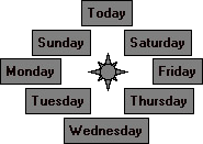
Don’t Be So Odd: Seven is Surprisingly (or not) Worse Than Eight
Kurtenbach and Buxton expected that the selection time would be monotonically increasing as you added more slices, but were surprised to find that 8 slices were faster than 7, and it kind of plateaued between 11 and 12.
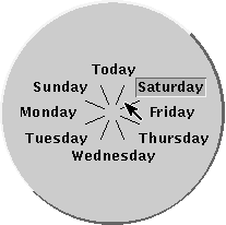
If you have 7 slices, it actually helps to add a dummy (or useful) slice to even the menu out! The “8 Days a Week” menu (described in the Design and Implementation article) adds “Today” to the top of a 7 weekday menu, splitting Sunday and Saturday!
Good Non-Hierarchal Example: MediaGraph Music Map Gestural Navigation and Editing
In the jQuery pie menu documentation, I explained:
One change is that I’m de-emphasizing the idea of “menus”, and just calling them “pies”, because I believe that framing pies as menus has too much historical baggage, does not emphasize their gestural, direct manipulative qualities, and precludes thinking of them more like a directed graph or geographical map, instead of a hierarchical tree.
In this MediaGraph demo, you can see two different approaches to pies working together.
1) Traditional hierarchical pop-up pie menus, supporting sub-menus, mouse ahead gestures, real time feedback, and pull-out slices that use the distance as a parameter to the selection. (0:36 in video) Not editable by the user, but used to edit the other kind of pie.
2) Non-hierarchical free-form navigational pie maps, for arranging a map of songs connected with roads into a bidirectionally navigable graph, which enables users to easily hop around the network with quick flicking gestures (3:20 in video), and even create, edit and navigate their own pie maps via direct manipulation (4:07 in video). Editable and navigable by the user. Seamlessly integrated with panning and zooming gestures.
For this demo and more examples, here’s a youtube playlist with some of my pie menu demos, in reverse-chronological order, which shows the evolution of designs over time.
Questions and Answers: Hacker News Discussion
alphapapa on Mar 5, 2016 [-]
I want to like pie menus, because it’s nice that all the entries are equidistant from the cursor. But I just can’t seem to like them.
Maybe it’s because they don’t lend themselves to scanning and sorting. It’s easy to sort a list of items alphabetically, and it’s easy to scan a list by moving my eye down across it, requiring nearly no horizontal eye movement to read the words. But a pie menu does not lend itself so naturally to alphabetical sorting, and scanning requires circular eye movement, which is less economical.
It also has seemed to me that pie menus don’t lend themselves as well to memorizing where entries are, perhaps because of the sorting issue. I can remember that a word starts with A and is at the top of a list, but remembering where a word belongs on a compass or clock face doesn’t seem as natural, unless the associated action is itself directional (up/down/left/right, north/south/east/west etc).
Here’s an example which comes to mind. Team Fortress 2 has quick-access voice lines which can be played with two keypresses, one to open one of three menus, and another to select a line from the menu. They are displayed in a compact list on the left side of the screen.
A newer game coming out soon, Overwatch, also has quick-access voice lines, but they are accessed through a pie menu that covers the entire screen, and items are selected with the mouse.
When I haven’t played TF2 for a while, I can be running around the map playing the game, hit one of the keys, and scan the list of commands to find the one I want so quickly that I don’t even have to think about it; my eye can sweep across the list in one motion. I just open a couple of the menus and then hit the key, all while running around the map, turning my character with the mouse, etc.
In Overwatch, this doesn’t work at all. If I don’t remember where a command is on the pie, I have to move my eye in a circle the diameter of which is nearly the entire height of the screen. This takes significant time and effort compared to scanning a list. It also blocks the screen, and it prevents the mouse from being used to control the character.
So, for actions and menus that are primarily directional in nature, and limited in number, I can see pie menus being a natural choice. But for menus that are non-directional, and especially ones that don’t lend themselves to memorization, pie menus seem objectively inferior to simple, vertical lists.
—
DonHopkins on Mar 6, 2016 [-]
All very true! Pie menus aren’t good for dynamically generated lists, or very many items.
To handle those inevitable cases, the jQuery pie menus (and other implementations like the OLPC Sugar pie menus) can support a hybrid mixture of directional pie items and traditional linear items, by simply adding multiple items to the same slice.
Example: OLPC Sugar Pie Menu Discussion
That would be cool! Note that the Python pie menus also support linear layout as well as hybrid pie/linear layout, and the application developer can control which items go into the pie and linear parts, and what directions they’re laid out in.
Good Example: Pull-out Font Pie Menu
Multiple items in the same slice are just laid out vertically (or horizontally, or even diagonally) in the slice direction, or it could display only the selected item in the slice, and switch between them as you pull out. The items can track based on entering/exiting rectangular label targets just like a linear menu, or by the distance (like a pull-out font size menu, etc).
Interesting Problem: Other Techniques for Handling Many Items
One straightforward technique is to put items into nested submenus. It takes thought and care to decide how to break up the items into submenus and how deep to arrange them. But first let’s see what happens if you have too many items!
Bad Example: The Most Gigantic Pie Menus In The World
Here’s a demo that shows some of the Most Gigantic Pie Menus in the World, the largest with 360 items. The first has a huge 24 item menu with 15 items each, and the second has a gargantuan 360 item menu that’s much bigger than the screen, and is thought to hold the world record for the Most Gigantic Pie Menu In The World.
Early pie menu demo by Don Hopkins, on NeWS 1.0, running on a Sun 3 workstation. Shows the Most Gigantic Pie Menus In The World at 2:54.
Good Example: Scrolling NeWS Pie Menus
I’ve also tried various forms of spiral scrolling, paging, and weird springy precision pie menu things. And also limiting the maximum number of pie items, so the first eight “most important” items are assigned to different directions, and subsequent items are laid out below or above the menu as linear items.
Weird Example: Springy Precision Pie Menu
Good Example: Method of Loci
Some people remember things spatially, and other people don’t. The Greeks invented a spatial memorization technique called the Method of Loci.
I developed an iPhone app that’s like a mind mapping application based on the Method of Loci, that let users easily construct their own navigable touch-screen pie menu maps.
Good Example: Micropolis (SimCity) Web Demo
Demo of Micropolis (SimCity) running on a Python web server back-end, with an OpenLaszlo/Flash client, including pie menus, and PacMan robots who eat traffic.
Constructionist Educational Open Source SimCity
The OLPC project is focused on “Constructionist Education”, which is about children learning — anyone learning, by building things. And SimCity is pretty much the quintessential constructionist education game.
Open Sourcing SimCity, from Chaim Gingold’s “Play Design” PhD Thesis
Pie menus play a critical role in The Sim’s user interface design, dovetailing perfectly with the object and AI architecture. Objects advertise verbs to character AI, so it is natural for the verbs to be arranged in a radial menu about objects. I can’t imagine an alternate design that would have had the same widespread usability, and therefore appeal, without them. It is difficult to imagine The Sims without pie menus. -Chaim Gingold, Play Design PhD Thesis, Open Sourcing SimCity
Spectacular Example: Simon Schneegans’ Gnome-Pie, the slick application launcher for Linux
I can’t understate how much I like Simon Schneegans’ Gnome-Pie, as well as his bachelor thesis work on the Coral-Menu and the Trace-Menu. Not only is it all slick, beautiful, and elegantly animated, but it’s properly well designed in all the important ways that make it Fitts’s Law Friendly and easy to use, and totally deeply customizable by normal users! It’s a spectacularly useful tour-de-force that Linux desktop users can personalize to their heart’s content.
Simon Schneegans’ Gnome-Pie
Gnome-Pie is a slick application launcher which I’m creating for Linux. It’s eye candy and pretty fun to work with. It offers multiple ways to improve your desktop experience.
Check out the project’s homepage and demo:
Simon Schneegans’ Bachelor Thesis
For the same reason they are effective. But by far the most remarkable advantage is their continuous learning curve. Users may become extremely fast just by using the menu. Every time they make a selection, they get faster and more accurate. At some point it is not necessary to read the labels anymore, because the user remembers the direction of an entry. With “normal” linear menus that is not possible. The maximum selection speed with a mouse is very limited and soon obtained.
The Coral-Menu
The first prototype is targeted at users who often search for items due to their manifold menu usage. It displays hierarchies with ease. Even very deep hierarchies are easy to explore. Many items are displayed by increasing the pie’s radius and stacking the labels which are displayed next to their sector on top of each other. The following clip demonstrates the behavior. As you can see, the items of sub-menus are indicated by little dark blobs at their parents. This menu is quite fast to use because of the mouse making a smooth movement.

The Trace-Menu
The second prototype addresses itself to users who often make use of the same menus. Thus they know where to find an entry and want to select it blazingly fast. In contrast to the Coral-Menu each sub-menu is a complete 360-degree-Pie-Menu with one entry being the parent menu. The hierarchy is visualized by a path between the visited menus. This menu features a so-called “Marking-Mode”: The user may draw the path (the “trace”) to the desired entry with one continuous gesture. Watch the following clip and you will understand this behavior — the Marking-Mode is used for the very last selection.

The visualization of wide menus is not shown in this clip. For this purpose the Trace-Menu generates artificial sub-menus when there are more than eight entries at one level. These sub-menus are labeled with all contained items. In order to select an item, the user first selects the generated sub-menu which contains the desired item and secondly selects the item itself.
4.2. Test results
Both prototypes are extraordinary innovative Pie-Menus which are able to display deep and wide menu structures. Nevertheless they suffer from major performance issues when an unknown items has to be searched for. That is a remarkable drawback since many menus are used rarely.
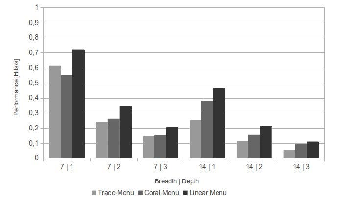
Performance Comparison of Trace-Menu, Coral-Menu and Liner Menu.
In addition, the results suggest that in everyday situations, users seldom realize the full potential of a system. The concentration that is necessary to perform selections very quickly in menus, is disproportionate to the few milliseconds, which can be obtained from such use. This finding does not mean that there is no point in constructing a theoretical fast system. Only is the performance gain that is achieved in practice, not comparable to the results of a study under controlled conditions. For this reason, the actual performance of Pie-Menus and their linear counterparts under real conditions are much closer than it had been suggested by theoretical considerations.
Free Source Code
The Fabrik Programming Environment
Frank Ludolph, Yu-Ying Chow, Dan Ingalls, Scott Wallace, Ken Doyle. Apple Computer.
Fabrik uses simple directional gestures to increase the number of commands associated with the mouse button.
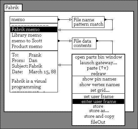
Unfortunately, no known videos and not many screenshots remain of Fabrik, but the paper describes the directional gesture menus in detail:
Abstract
Fabrik is an experimental interactive graphical programming environment designed to simplify the programming process by integrating the user interface, the programming language and its representation, and the environmental languages used to construct and debug programs. The programming language uses a functional, bidirectional data-flow model that trivializes syntax and eliminates the need for some traditional programming abstractions. Program synthesis is simplified by the use of aggregate application-specific operations, modifiable examples, and the direct construction of graphical elements. The user interface includes several features designed to ease the construction and editing of the program graphs. Understanding of both individual functions and program operation are aided by immediate execution and feedback as the program is edited.

Directional Gestures
Fabrik uses simple directional gestures to increase the number of commands associated with the mouse button. The user initiates a gesture-based operation by positioning the cursor over an object, pressing the button and moving in a specific direction. Once the initial direction, hence operation, is established, the mouse may then be moved in any direction to complete the operation. If no significant cursor movement occurs within a half-second after the mouse button is pressed, a pop-up “gesture menu,” such as those shown in figure 2, appears under the cursor. The short delay prevents flashing during normal editing but provides prompting for less commonly used operations.
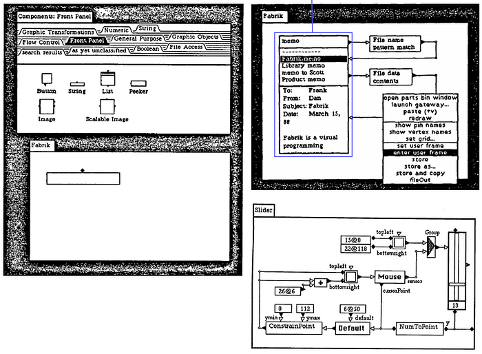
Built on Smalltalk (Mac)
For example, a gesture menu is used to both move and connect pins and vertices because their small, eight-pixel-square size is not large enough to allow separate areas to be designated for each operation. A connection is initiated buy clicking on the pin / vertex and moving in one direction, while relocation is initiated by clicking and moving in a different direction. An additional set of gestures is defined for the editing window background and includes operations such as group select and delete.
The intent was to create a very fast form of command invocation using just one hand and is somewhat different from both pie menus [13] and full gestures [14]. Gestures require more complex movements that are difficult to perform with a mouse and are slow compared to a directional gesture. Pie and other forms of pop-up menus require the mouse button to be released over specific area to invoke the command, an action inappropriate for certain actions such as moving and drawing. There is also a visual feedback loop from eye to hand that slows command invocation.
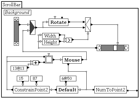
Demonstrating the rotational logic.
All display and mouse-tracking operations are properly scaled and rotated.
Although no formal user-testing has been performed, experience suggests that the design of gesture menus is fairly critical. Four unique directions seems the maximum for fast error-free operation using a mouse, though wedges as small as 45 degrees may have acceptably low error-rates. The near-reflex response of learned movements to pre-conscious intent requires that common operations appearing on more than one menu must use the same direction regardless of context or high error rates will occur. And the asymmetrical movement of the human wrist means that left-hand / right-hand differences should be considered.
The left three panels have been selected as the “user frame”,
and a menu command lets one “enter” that frame.
User reception to gestures used in this way has been mixed. While established Fabrik users have few complaints, new users split about 50–50 initially until they learn to first establish the operation, then the direction. Even among some experienced users the feeling persists that other approaches might be more appropriate for operations that inherently include arbitrary direction, e.g. moving and drawing.
Matthias Schreck on Pie Menus / Radial Menus
Excellent presentation about pie menus by Matthias Schreck, Design Manager, including a description of Krystian Samp’s work.
I held a 15 minute presentation in front of the IxDA (Sydney Chapter) in August 2012 about pie / radial menus. I spent a little bit of time talking about their history, and about various classifications of this menu type, and then went into detail about the academic research that has been done in that field. I summarized about 10 articles in this field, but the main body of the academic part is based on an excellent research thesis by Krystian Samp.
Globalmoxie: Touch Means a New Chance for Radial Menus
The radial menu is seeing a renaissance in touch interfaces, and that’s a good thing.
User Learning and Performance with Marking Menus
Gordon Kurtenbach, William Buxton, 1994. Proceedings of CHI ’94, p. 258–264.
A marking menu is designed to allow a user to perform a menu selection by either popping-up a radial (or pie) menu, or by making a straight mark in the direction of the desired menu item without popping-up the menu. Previous evaluations in laboratory settings have shown the potential of marking menus. This paper reports on a case study of user behavior with marking menus in a real work situation.
The study demonstrates the following: First, marking menus are used as designed. When users become expert with the menus, marks are used extensively. However, the transition to using marks is not one way. Expert users still switch back to menus to refresh their memory of menu layout. Second, marking is an extremely efficient interaction technique. Using a mark on average was 3.5 times faster than selection using the menu. Finally, design principles can be followed that make menu item/mark associations easier to learn, and interaction efficient.
Recommendation Letter for Krystian Samp’s Thesis: The Design and Evaluation of Graphical Radial Menus
I am writing this letter to enthusiastically recommend that you consider Krystian Samp’s thesis, “The Design and Evaluation of Graphical Radial Menus”, for the ACM Doctoral Dissertation Award.
I believe Krystian Samp’s dissertation is a significant contribution to basic computing research that focuses on user interface design, because it clearly presents a carefully planned, controlled study of a thoughtfully justified and practically executed design, which valuably advances the state of the art. Recognition for Samp’s work from ACM would dramatically raise visibility of research excellence that contributes to theory and practice. The evaluation shows that designing with performance in mind can result in faster graphical menus compared to traditional menus. The proposed Compact Radial Layout menu is approximately 20–30% faster in a variety of conditions, reduces navigation errors, induces users to faster movements and decreases screen consumption. The evaluation also shows that, with a consistent pattern of organizing items in radial menus, search and navigation performance can be further improved. At the same time, the results indicate that the improved navigation performance in radial menus comes at the cost of slower visual search.
The Design and Evaluation of Graphical Radial Menus
Krystian Samp. National University of Ireland, Galway.
The evaluation shows that designing with performance in mind can result in faster graphical menus compared to traditional menus. The proposed Compact Radial Layout menu is approximately 20–30% faster in a variety of conditions, reduces navigation errors, induces users to faster movements and decreases screen consumption. The evaluation also shows that, with a consistent pattern of organizing items in radial menus, search and navigation performance can be further improved. At the same time, the results indicate that the improved navigation performance in radial menus comes at the cost of slower visual search.
Visual Search in Radial Menus
Krystian Samp, Stefan Decker. INTERACT 2011, Part IV, LNCS 6949, p. 248–255.
Menu research has focused predominantly on linear menus (e.g., cascading menus). Little is known about user behavior with radial menus, which have been around for some time. The paper investigates the order in which users find items in radial menus. We analyze data collected in a controlled experiment and define serial position for items laid out in a circular fashion. For the first level (ring), the serial positions start at 12 o’clock position and alternate between both sides of the ring. For subsequent levels, the serial positions follow distance from a parent item. The defined search pattern yields strong fit and has substantial effect on search performance. We discuss the results in the context of radial menu design.
Obsessed With Pie!
And now a final word from Weebl and Bob: “PIE!!!”
The Email that Started My Amazing Journey
To: hcil@mimsy.umd.edu
Cc: don@mimsy.umd.edu
Subject: circular menus
Date: Mon, 19 May 86 09:49:51 -0500
From: Mark Weiser <mark@markssun.cs.umd.edu>A student of mine is thinking of building circular popup menus
into the Sun window system. Here is his description of them.Note particularly what happens if you follow a menu tree using these menus —
you get a shape on the screen which represents the path you followed.
Experts remember long paths by muscle memory (“zig-zag-zig-zig-zag”)
instead of symbolically (“hjjkhj”).I don’t know of anything similar. Anyone else? Other comments?
-mark
— — — — Forwarded MessageDate: Sun, 18 May 86 21:50:27 EDT
From: Don Hopkins <don@brillig.umd.edu>
To: mark@brillig.umd.edu
Subject: Theta MenusHere are some preliminary notes and ideas…
Theta Menus
Menu selection is based on the angle between the mouse down
event and the mouse up event. The radius should not have any bearing
on which menu item is selected, and could even be used as an argument
to the item.The advantage is that if the user is familiar with the menu,
no visual feedback is required to select an item. Just the direction
has to be known. There is no need to slow the mouse down and “park” in
in a small rectangle as with conventional pull down menus. If the user
is familiar with the menu, then no visual attention at all is
necessary. Thus you can be looking at something in one window while
traversing menus in another. Pull down menus require that you move in
the same direction every time you choose them (thus discarding theta),
and depend on how far you move the mouse (depending on the radius
instead). With pull down menus, there is no advantage to having fewer
menu items, because you need just as precise control to choose each
item.A mouse down event should pop up a menu of n items, such that
each item maps to a certian range of degrees, or sector, and the sum
of the sector widths is 360 degrees. It might be nice to make some
sectors wider than others, so that they are easier to choose. There
should be a way to specify where around the circle the first one
starts.When the mouse down event happens, a menu, whose center is
where the event occured, should pop up, showing sectors and the item
they select. As the mouse is subsequently moved around, the item whose
sector contains the angle between the menu center and the current
mouse location should be highlighted. When the mouse up event happens,
the current highlighted item should be chosen.There might be a safe zone around the menu center, of a
certian radius, in which no sectors are highlighted. If the mouse up
event happens here, no items are chosen. Mousing down, then up without
moving would simply show the menu without choosing anything.
Alternately, one of the other mouse buttons could abort the selection.
(The latter has the advantage that no visual feedback is required.)As the mouse is moved further away from the center of the
menu, the user has more precise control over which item is selected,
because when the radius is greater, motion has less effect upon the
radius.Some items could be submenus, which would be overlayed,
offset in the direction of the item, by a certian radius. You could
then see the path you used to get to a menu. There could be a way to
take a step back to the previous menu, and make another selection from
it.Applications:
Choosing between n items, each item having a sector of 360/n
degrees.Setting the time of an analog clock. Use one button to set the
minute hand, and the other to set the hour hand. Move in the direction
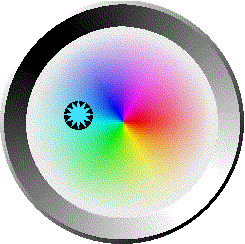
you want it pointing.Choosing from a color pallete. The menu is a circle of colors.
Move in the direction of the color you want.Answering yes or no questions. Up for yes, down for no.
Scrolling the screen. The radius could supply an argument for
how far to scroll. Compare to scroll bars: You do not have to stop
looking at what you’re scrolling to aim the mouse at a scroll bar.Choosing percentages. Right for 25%, down for 50%, etc.
Specifying a direction (and distance) to move in a game or
whatever.Incorporate audio feedback for the blind.
Dedicated to Mark Weiser
Photo courtesy of (and with) Corinne Iloreta and Nicole Reich-Weiser.
“For thirty years most interface design, and most comptuer design, has been headed down the path of the “dramatic” machine. Its highest idea is to make a computer so exciting, so wonderful, so interesting, that we never want to be without it. A less-traveled path I call the “invisible”; its highest idea is to make a computer so imbedded, so fitting, so natural, that we use it without even thinking about it.” -Mark Weiser
The Philosopher of Palo Alto
Good tools, in light of Weiser’s legacy, are not just extensions of one’s mind or body. More profoundly, technologies at their best may serve as liaisons, linking each of us to subtleties in the dynamic, singular, living patch of earth we inhabit right now. The apex of Weiser’s prescient ambitions are still ahead of us, unreached. We have hit a point, though, where almost every “next big thing” in tech builds on his early blueprints. With each new app inspired by Pokémon Go and every 9-figure investment in startups like Magic Leap, mobile and wearable interface stand to become a little less like miniaturized desktops and a bit more like a digital looking glass we point toward the world around us.
The Computer for the 21st Century
Vol. 265, №3, SPECIAL ISSUE: Communications, Computers and Networks: How to Work, Play and Thrive in Cyberspace (SEPTEMBER 1991), pp. 94–105
“The most profound technologies are those that disappear. They weave themselves into the fabric of everyday life until they are indistinguishable from it.” -Mark Weiser
The Computer for the 21st Century,
published in 1991 in Scientific American.
Designing Calm Technology
It seems contradictory to say, in the face of frequent complaints about information overload, that more information could be encalming. It seems almost nonsensical to say that the way to become attuned to more information is to attend to it less. It is these apparently bizarre features that may account for why so few designs properly take into account center and periphery to achieve an increased sense of locatedness. But such designs are crucial. Once we are located in a world, the door is opened to social interactions among shared things in that world. As we learn to design calm technology, we will enrich not only our space of artifacts, but also our opportunities for being with other people. Thus may design of calm technology come to play a central role in a more humanly empowered twenty-first century.